Populii UX Transformation

Populii is a platform focused on helping organizations shape and assess workplace culture. Over time, its ecosystem expanded to include both culture-shaping skills and assessment tools, originally split across two separate entities — Populii and Orgfitech.

After merging under a single brand, the platform struggled to reflect this shift. Information was fragmented, navigation lacked clarity, and users were unable to clearly understand how the offerings connected.

This project focused on transforming a disconnected experience into a cohesive, structured system that simplifies how users discover, understand, and navigate Populii’s offerings.

Role: UX Researcher & Team Lead (5-person team)
Timeline: January 2025 – April 2025
Scope: Information Architecture, Brand Integration, Website Redesign, Visual System Alignment


The Problem

When Populii absorbed OrgFitech, the two product lines never merged in the experience. The website still carried two visual identities and split its offerings across three overlapping portfolios, with the OrgFitech tools sitting under a separate brand entirely.


For users — HR professionals, recruiters, and business leaders — this created real confusion: it wasn’t clear what Populii actually offered, how the tools related, or where to start. The problem wasn’t visual polish. It was structural: the information architecture reflected the company’s internal history, not the user’s needs.


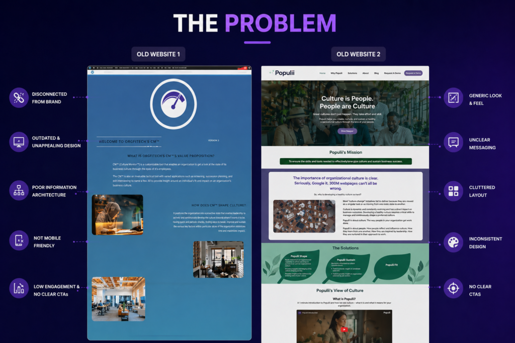
Understanding the Problem

As UX researcher, I grounded the redesign in three inputs rather than assumptions:

Stakeholder interviews. I interviewed Populii’s CEO and COO directly to understand the business, the two product lines, and — critically — who they were actually trying to reach.

Competitor analysis. I mapped Populii and OrgFitech against each other and the market, which surfaced the core tension: one side was human-centric (training, consulting, workshops), the other tech-driven (AI-based culture and hiring tools). The website was trying to speak both languages at once, without structure.

Heuristic review of the existing site. I audited the live experience for usability and navigation issues, identifying where the fragmented structure created the most friction.

Together these pointed to one insight: users don’t think in terms of brands or company history — they think in terms of what they need and how to achieve it. The site needed to be organized around user intent, not internal structure.


Defining the Direction
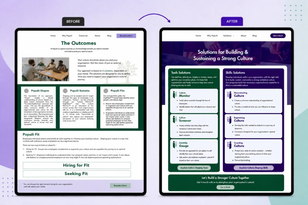
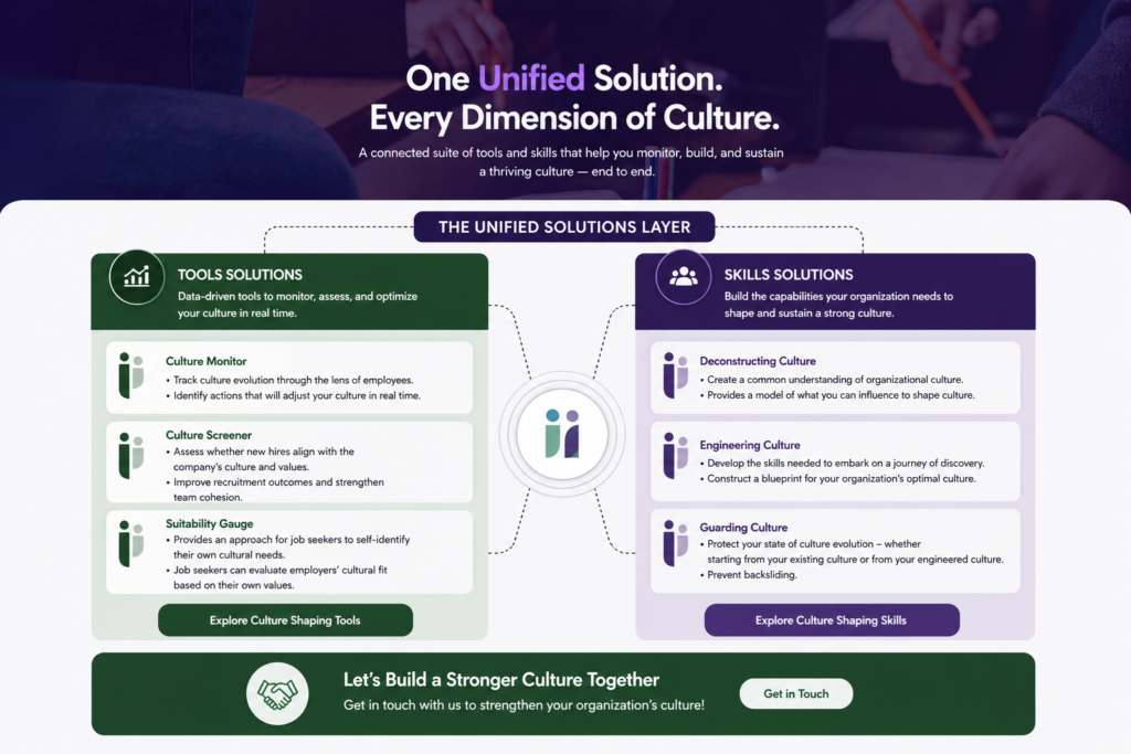
The central move was consolidation. Working from the research, we restructured three overlapping portfolios into two clear, purpose-based categories:

Culture Tools — Culture Monitor, Culture Screener, Suitability Gauge (the former OrgFitech tools, now folded into Populii)
Skills & Knowledge — Deconstructing Culture, Engineering Culture, Guarding Culture

This single distinction did most of the work. Instead of navigating three ambiguous groupings across two brands, users could immediately grasp the two things Populii offers: tools to assess culture, and skills to shape it. A unified Solutions layer became the primary entry point, presenting the whole system in one structured place.


Solution

Re-structuring the Experience Around “Solutions”

To bring clarity to the experience, we introduced a centralized Solutions layer that acts as the primary entry point.

This replaced fragmented navigation with a single, structured overview of what Populii offers. Instead of searching across disconnected pages, users can now understand the full system in one place.


Structuring Around User Understanding

Within this layer, offerings were organized into clearly defined categories based on their purpose:

  • Culture shaping skills
  • Assessment tools

This simple distinction solved a major clarity issue. Users could now immediately understand what each offering does and how it fits into their needs.


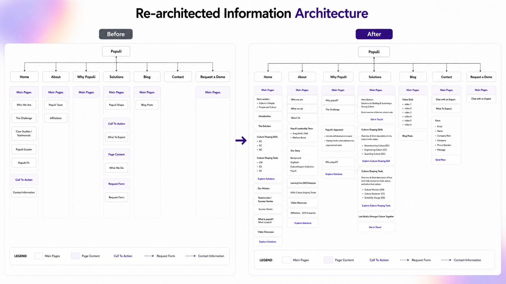
Re-architected Information Architecture

The navigation and sitemap were redesigned to support this new structure.

Content was reorganized based on user intent rather than internal logic, making it easier to explore the platform without prior knowledge.


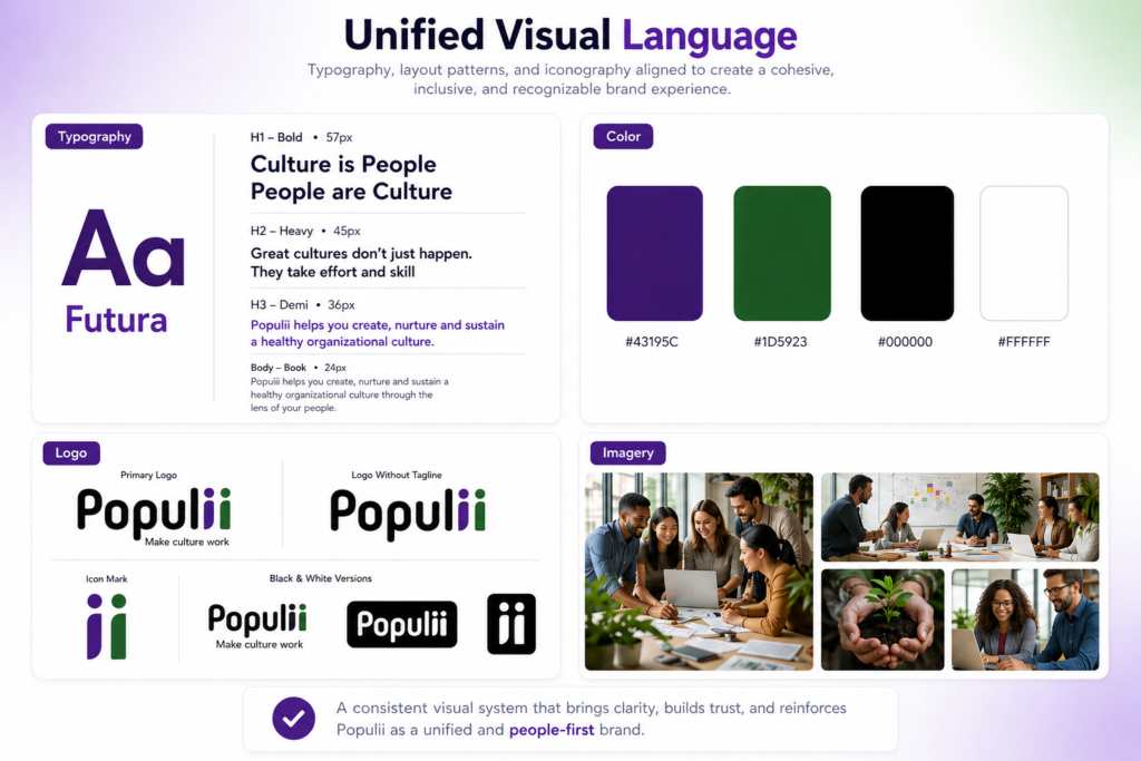
Unifying the Visual Language

To support the structural changes, we established a consistent visual system across the platform.

Typography, layout patterns, and iconography were aligned to create a cohesive experience that reinforces the idea of a single, unified product.


What the team delivered

Across the engagement, the team produced a full research-to-handoff package: four user personas, a user journey map, a restructured information architecture and sitemap, service iconography, a unified style guide, responsive wireframes and prototypes, and a WordPress build with a client handoff and tutorial. As team lead, I coordinated these deliverables across five people while owning the research workstream.


Outcome

The redesign reframed a fragmented, two-brand website into a single coherent system organized around what users actually need. The consolidation from three portfolios to two, validated with Populii’s leadership, gave the platform a clear structure it previously lacked, and the unified visual system tied the merged brands into one identity.

The work was delivered to Populii as a complete handoff package through Algonquin’s Applied Research program. The engagement continues to evolve as the client builds on it across subsequent teams.

Honest note: as a time-boxed applied project, the redesign was validated through stakeholder review rather than post-launch user testing — a structured usability study with HR professionals and recruiters was scoped as the natural next step.


Reflection

This project reinforced that strong UX is not about adding more, it’s about creating clarity.

The biggest shift came from moving away from a page-by-page approach and thinking in terms of systems. Once the structure was defined correctly, everything else, navigation, layout, and visuals, naturally aligned.

It also highlighted the importance of designing for scale. Solving the immediate problem is not enough if the system cannot support future growth.

Leading a five-person team also taught me that UX leadership is as much about keeping a shared vision aligned across designers and developers as it is about the design itself, the structure has to live in the team, not just the file.