The Problem
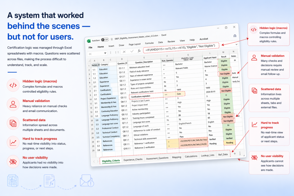
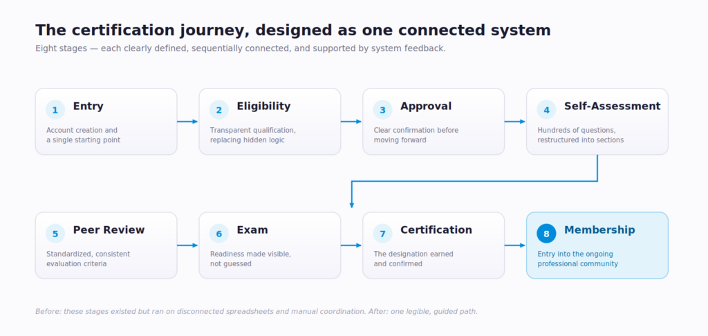
Understanding the System
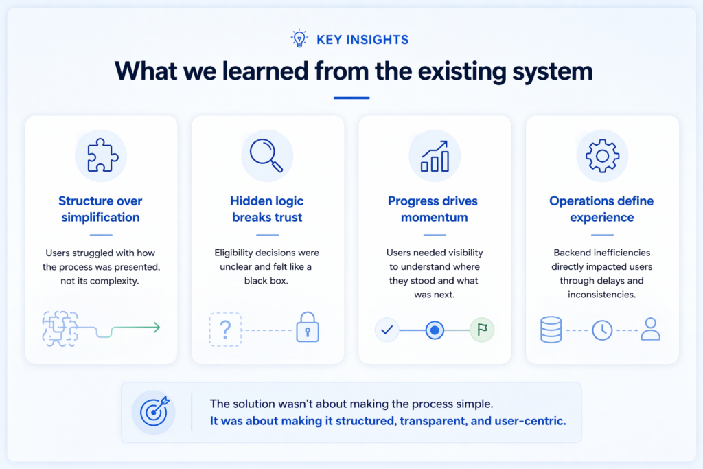
Key Insights
Design Approach
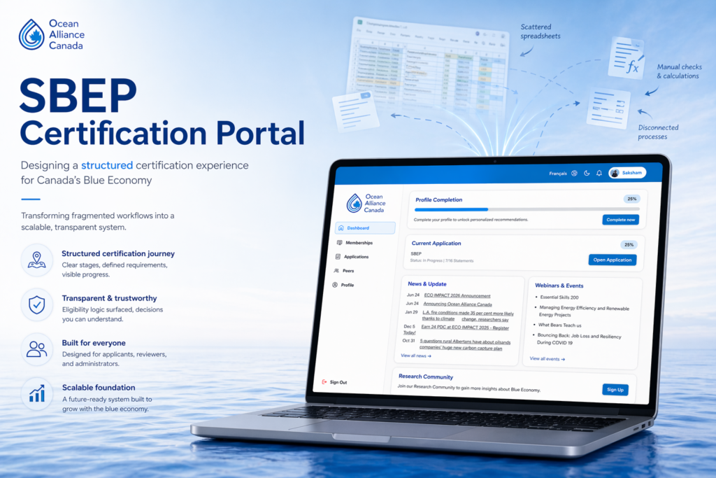
The Solution
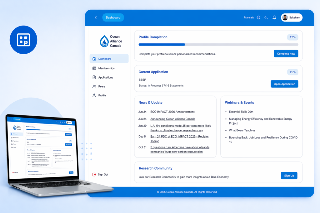
Centralized Dashboard
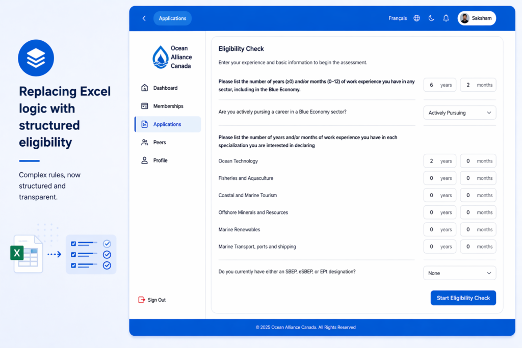
Replacing Excel Logic with Structured Eligibility
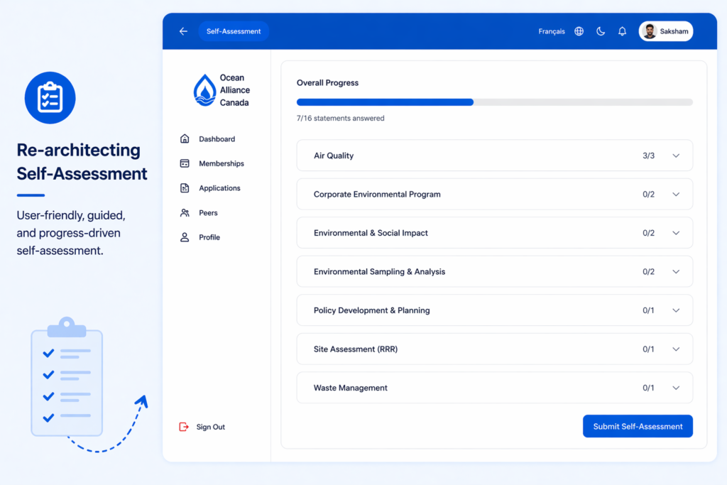
Re-architecting Self-Assessment
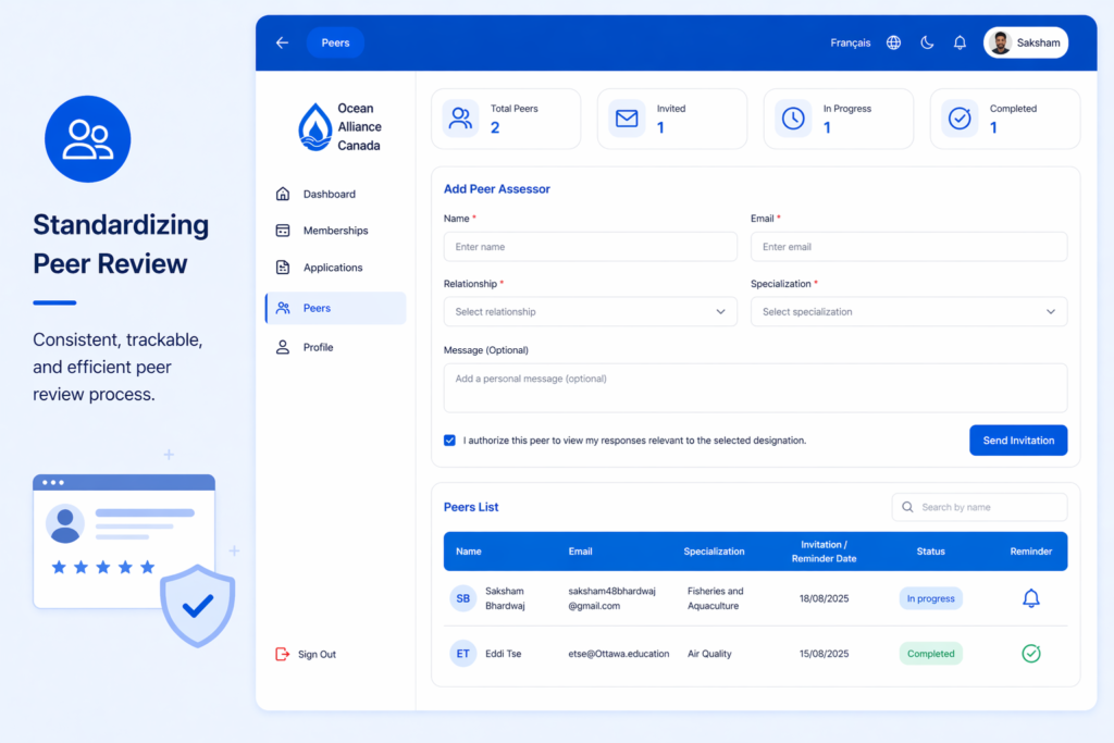
Standardizing Peer Review
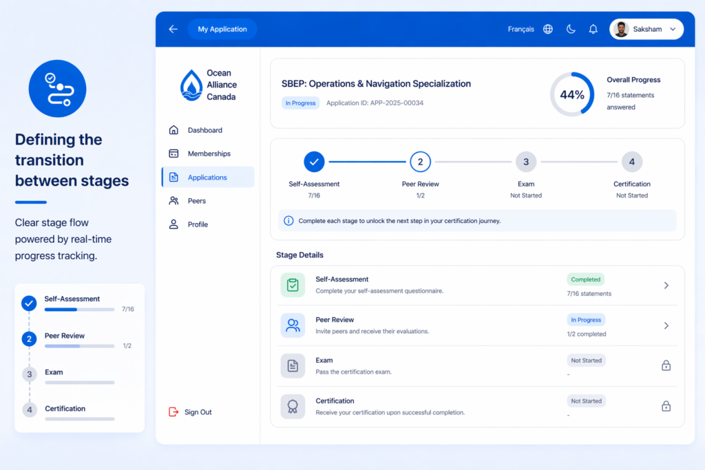
Defining Transitions Between Stages
From Design to Shipped Code
Impact
Reflection
More Projects