Sooter’s Photography Rebranding
-
Category
Website Redesign
-
Role
Team Lead
-
Project Start Date
September 02, 2024
-
Tag
UI Design , Website
-
Tools
Figma
-
Project End Date
December 20, 2024

Overview
Sooters is a Canadian photo studio brand with deep emotional value, known for preserving memories for generations. However, its brand identity hadn’t evolved with the times. The visual aesthetic felt outdated, the tone was inconsistent, and the digital presence didn’t resonate with today’s users.
The goal of this rebranding project was to modernize Sooters while still honoring its nostalgic value. I led this project from ideation to execution, covering brand strategy, research, visual identity design, and a UX-focused prototype for the website.
The Challenge
Rebranding Sooters presented a unique challenge: How do you modernize a legacy brand without alienating the emotional connection that people have with it?
Sooters was struggling with inconsistent visual language, unclear messaging, and an outdated website that didn’t appeal to its evolving customer base. While older generations cherished the sentiment attached to photo prints, younger users sought intuitive experiences, aesthetics, and convenience.
The challenge lay in striking the right balance—preserving emotion and trust, while presenting a clean, modern brand that could appeal to a broader audience.
The Creative Brief
The rebranding effort started with a clear and concise creative brief that set the tone for the entire project. Sooters needed to reflect warmth and authenticity—feelings tied to memory-making—while presenting itself as a modern, premium yet approachable service.
The updated brand would target young couples, creative professionals, and modern families who value both emotional resonance and digital ease. It would embody trust, clarity, and timelessness. Every design choice was made to align with these brand values.
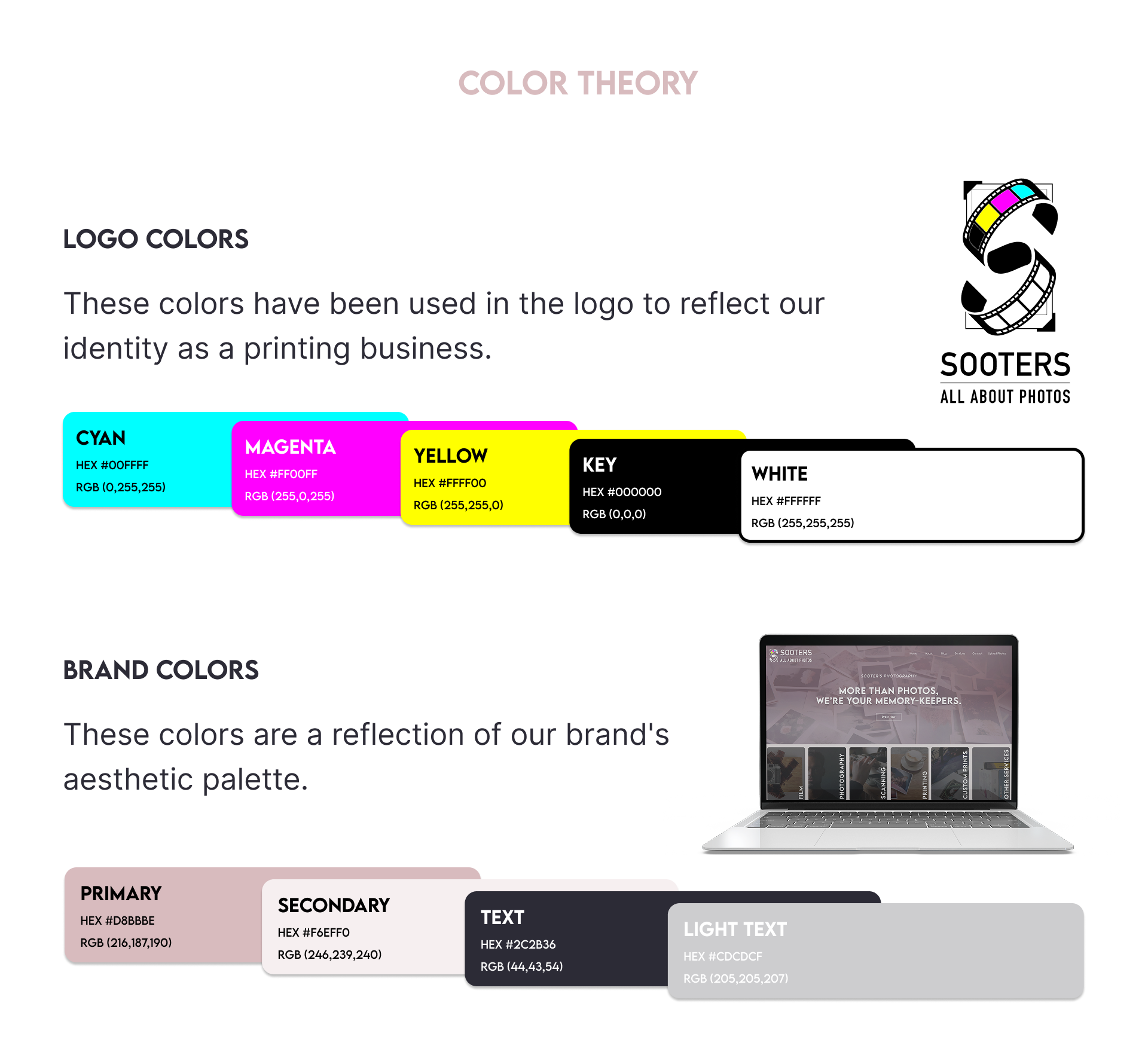
Moodboard & Style Guide
Before diving into final visuals, I created a moodboard to explore the emotional atmosphere the brand should convey. This visual exploration included soft lighting, vintage textures, neutral tones, and intimate human moments—capturing the essence of nostalgia in a modern format.
From this, I built a comprehensive style guide. The typography blended a sense of tradition and modernity—using Playfair Display for headings, evoking elegance, and Lato for body text, ensuring readability and versatility. The color palette was anchored in earthy neutrals and soft terracotta tones, offering a grounded yet warm feel. These choices were meant to subtly remind users of analog photography while feeling contemporary on digital screens.
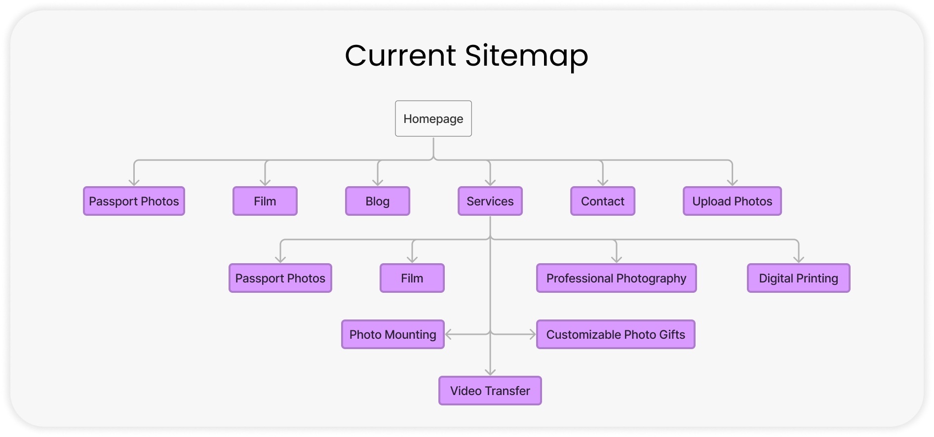
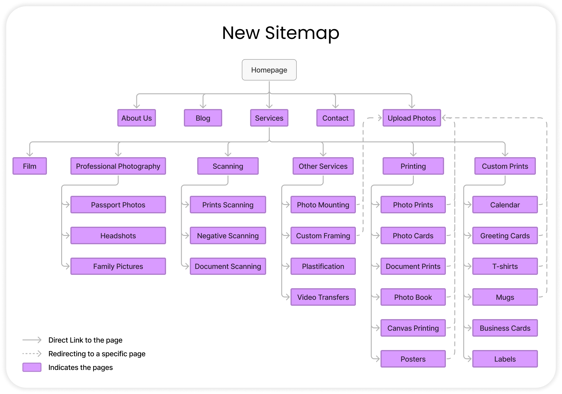
Sitemap & UX Approach
The website was restructured to prioritize clarity and flow. I created a simplified sitemap that grouped offerings logically, guiding users through a journey rather than overwhelming them with choices. The key sections—Home, Services, Book a Session, Photo Products, and Contact—were chosen based on user goals and common user journeys from the persona research.
Rather than complicating the flow with dropdowns or nested menus, I designed a layout where each page acts as a focused experience, ensuring users can take action without distraction.
Low-Fidelity Wireframes
Wireframing allowed me to lay the foundation for the user interface before adding any color or branding. These grayscale layouts focused entirely on structure, usability, and hierarchy.
The goal was to ensure that users—like Emily—could scan pages quickly, find information without friction, and engage with the brand effortlessly. Key elements like CTAs, product listings, and the booking form were carefully placed with accessibility and conversion in mind.
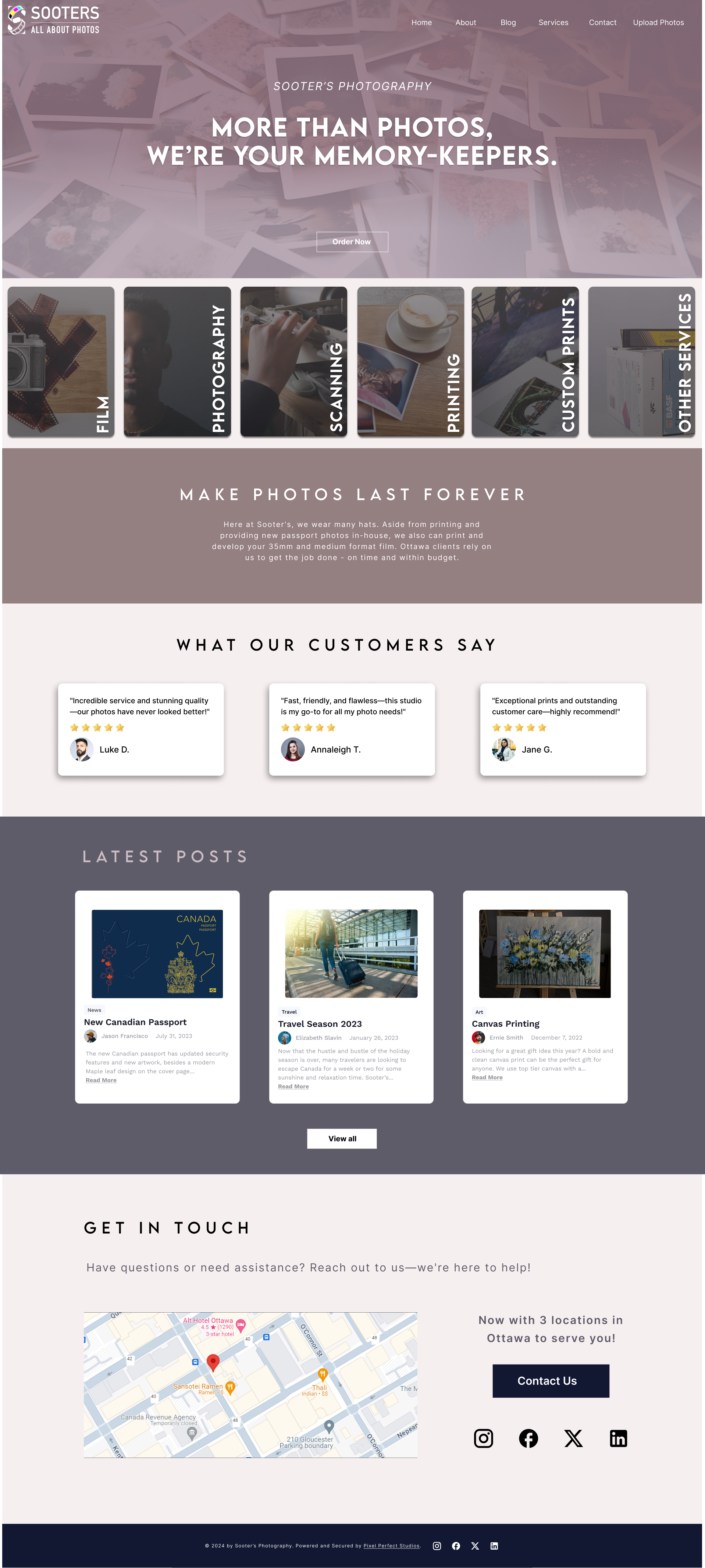
High-Fidelity Prototypes
Once the structure was validated, I moved into high-fidelity designs that combined visual identity with functional UX. The prototypes presented a calming, minimalist interface with clear touchpoints and interactive flows.
The homepage featured strong imagery and a welcoming message, the services page highlighted options with clean product photography, and the booking section was optimized for mobile use. Every visual detail was chosen to express warmth, clarity, and trust.
These prototypes were presented through an interactive Figma file and tested with peers, who responded positively to both the aesthetics and the improved user experience.
Final Reflections
This rebranding exercise was more than just a visual makeover. It was about rebuilding trust, reigniting emotion, and reshaping perception. Through intentional design choices and a research-backed strategy, Sooters now stands with a renewed identity—one that honors its past while confidently stepping into the future.
This project deepened my appreciation for balancing business goals with human emotion. It also strengthened my ability to create scalable design systems that feel personal and intuitive across mediums.