
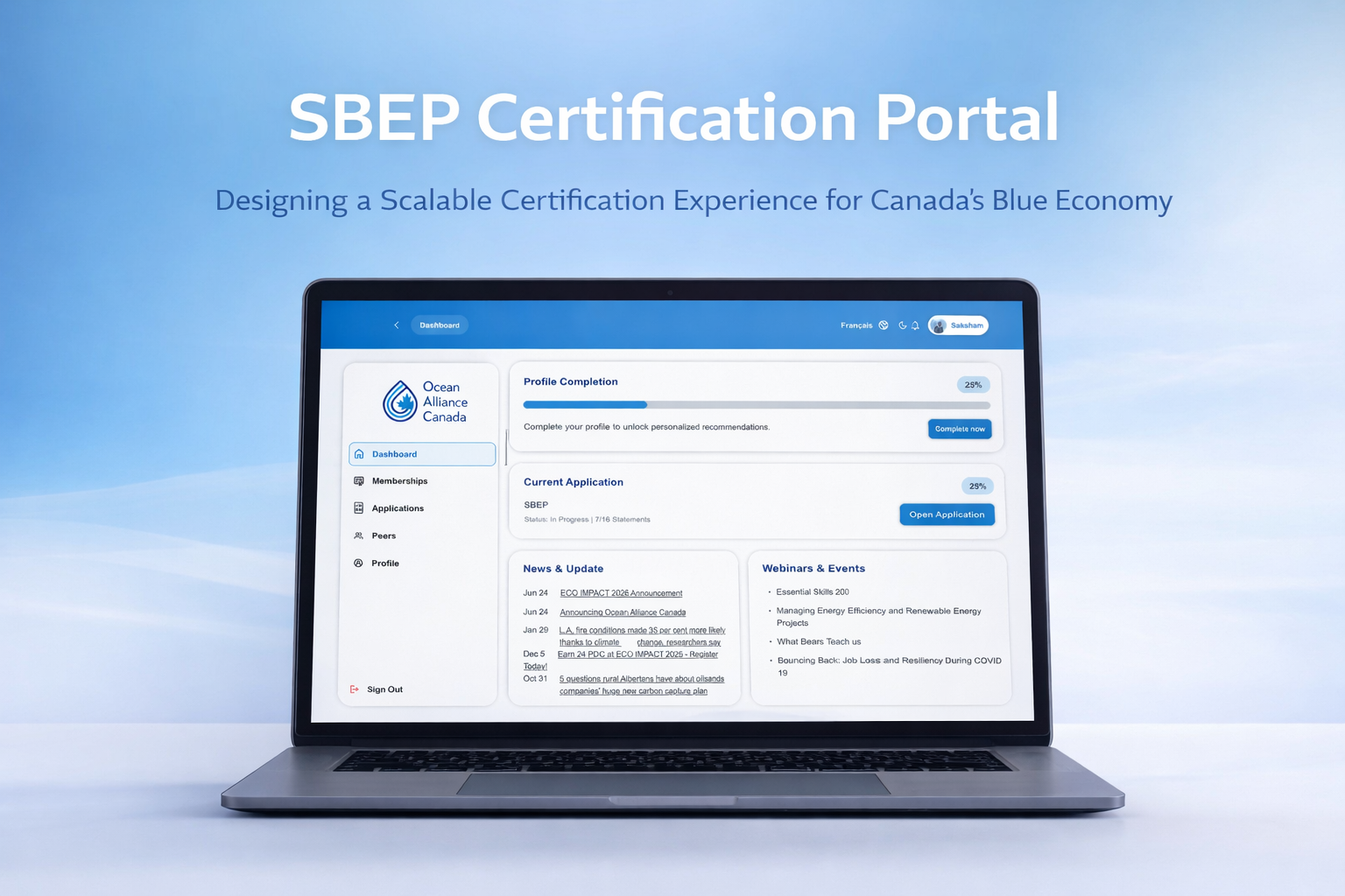
SBEP Certification Portal
-
Category
Portal Design & Development
-
Role
Senior UX Designer & Front-End Developer
-
Project Start Date
August 2025
-
Tools
Figma , Next.Js , Sitefinity
-
Tag
UI/UX design , Website
-
Project End Date
November 2025
Introduction
When ECO Canada introduced the Sustainable Blue Economy Professional (SBEP) designation, the goal was ambitious: create a nationally recognized certification that validates professionals working across Canada’s marine and freshwater sustainability sectors.
However, the process behind the certification—eligibility checks, competency assessments, peer reviews, payments, and exam scheduling—was inherently complex. Much of this complexity was hidden behind manual workflows and disconnected systems, making the experience difficult for both applicants and administrators.
I joined the project to help design and build a single, scalable digital portal that could support this entire journey while remaining clear, accessible, and trustworthy for users navigating a high-stakes certification.
The Challenge
From the applicant’s perspective, the certification process felt overwhelming. Users often didn’t know if they were eligible, what documents were required, or where they stood once they submitted an application. The lack of visibility created uncertainty, which is especially problematic when users are investing time, money, and professional credibility.
From ECO Canada’s perspective, the process was resource-intensive. Manual reviews, inconsistent data, and limited system visibility made it difficult to scale the program or confidently support future certifications.
The challenge wasn’t just to design screens—it was to design a system that could turn a complex policy-driven process into an intuitive digital experience, without oversimplifying the underlying requirements.
My Role
I worked on this project as both a UX Designer and Frontend Developer, owning the experience from early discovery through implementation. This meant translating certification frameworks into usable workflows, designing high-fidelity interfaces, and building production-ready components using Next.js and Tailwind CSS, while ensuring smooth integration with Dataverse and Dynamics 365.
Working closely with stakeholders, project managers, and technical leads, I helped bridge the gap between business rules and human-centered design.
Understanding the Problem Space
Early in the project, I reviewed ECO Canada’s certification documentation, statements of work, and internal process flows. These materials made one thing clear: the complexity of the certification couldn’t be removed—but it could be structured.
A key insight emerged during this phase: Users don’t need fewer steps—they need clarity and confidence at each step.
Applicants were willing to complete a detailed process as long as they understood why each step mattered, what was expected of them, and what would happen next.
Designing the Experience
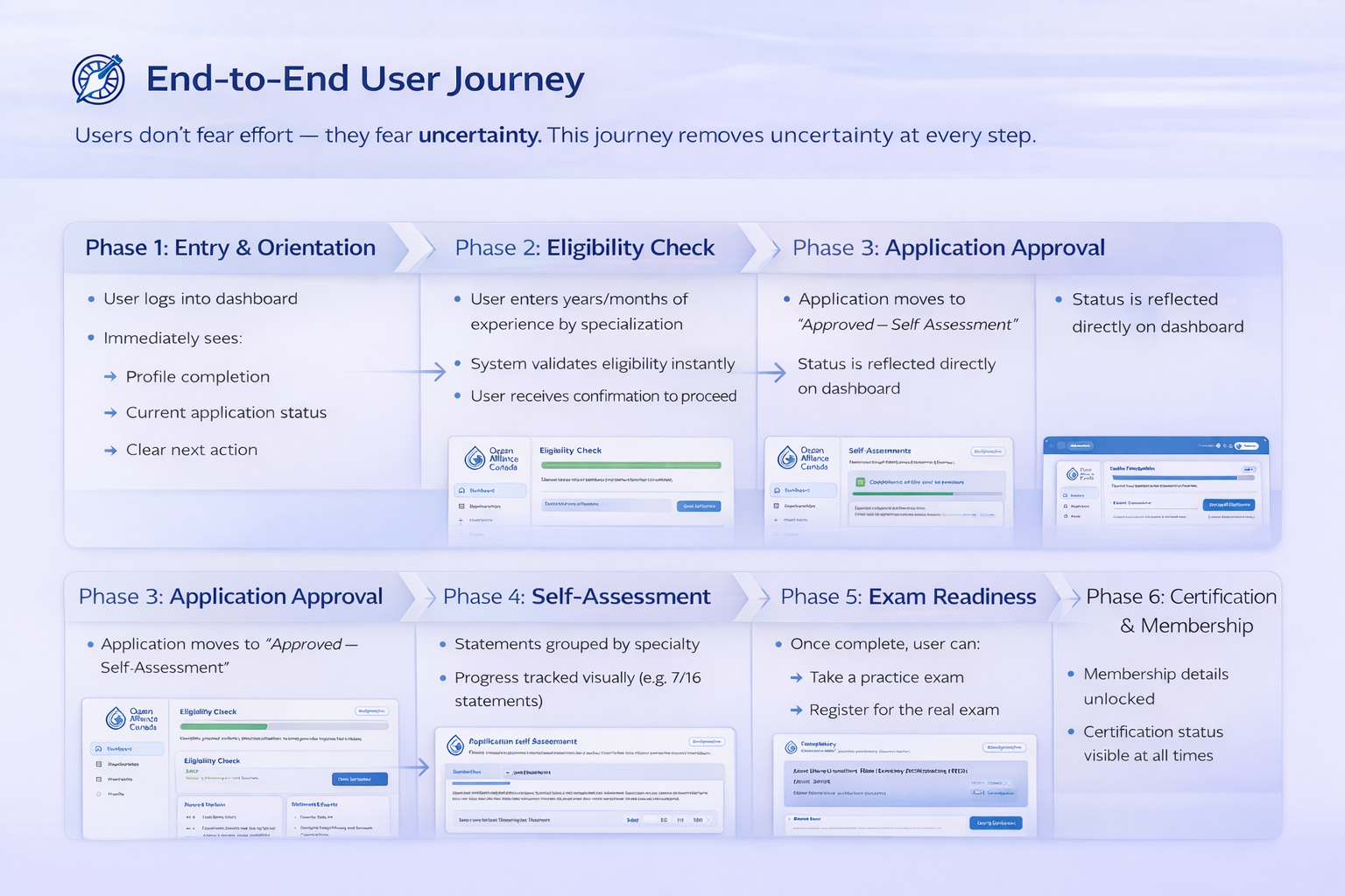
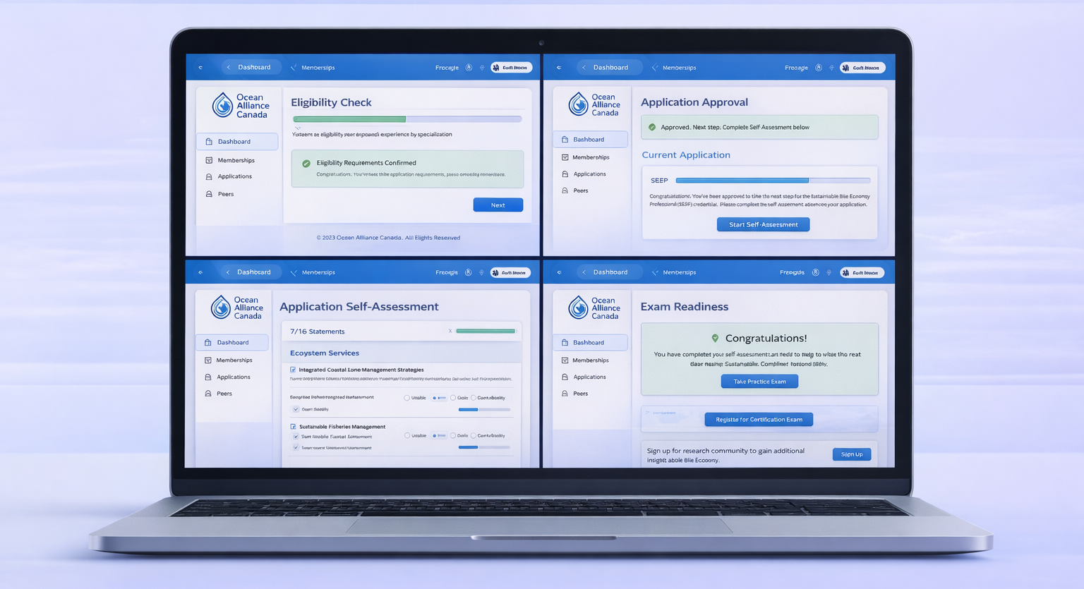
To address this, I structured the portal around distinct certification phases, each with a clear purpose and outcome. Instead of presenting everything at once, the experience guides users through eligibility checks, self-assessment, peer review, payment, and exam scheduling in a controlled, step-by-step manner.
Progress visibility became a central design pillar. At any point, users can clearly see:
- What stage they are in
- What actions are required
- Whether their submission is under review, approved, or pending
This approach helped reduce anxiety and reinforced trust in the process.
Design Approach & UI Decisions
The visual design intentionally remained calm, neutral, and professional—aligned with government and institutional expectations. I prioritized accessibility, readability, and consistency across all screens.
Rather than relying on dense forms, I used progressive disclosure to reveal information only when it became relevant. Clear helper text, validation, and system feedback were embedded directly into the flow, preventing errors before submission rather than reacting to them afterward.
Each screen was designed not as an isolated UI, but as part of a state-driven system, where backend logic controlled what users could see and do based on their certification status.
Building the Portal
On the technical side, I implemented the designs using Next.js, ensuring the application was responsive, performant, and scalable. Tailwind CSS allowed for rapid iteration while maintaining design consistency.
Integration with Dataverse and Dynamics 365 was critical. The frontend had to accurately reflect backend states such as eligibility approval, peer review completion, and payment confirmation. By tightly coupling UI states with backend data, the portal minimized inconsistencies and reduced the need for manual intervention.
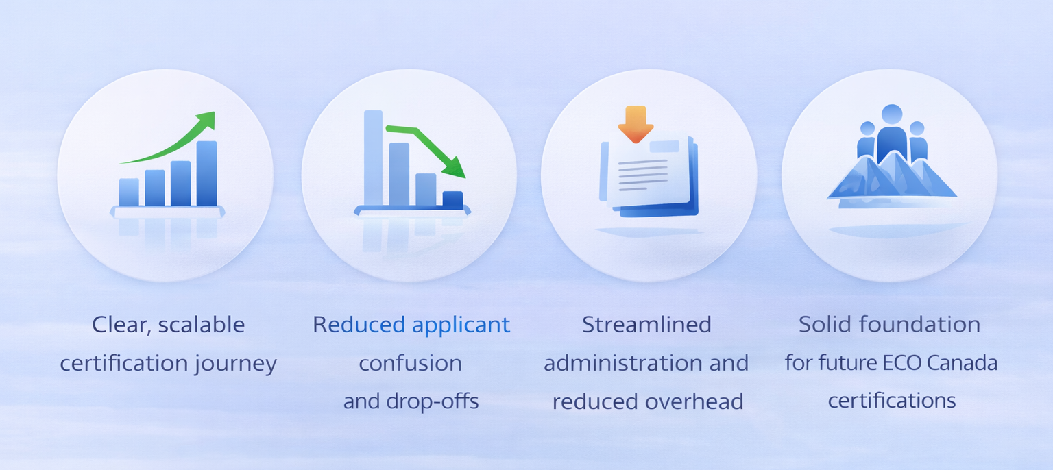
Outcome & Impact
The final SBEP portal delivered a significantly improved experience for both applicants and administrators.
Applicants now move through the certification process with clarity and confidence, always knowing where they stand and what’s required next. ECO Canada benefits from a streamlined, scalable system that reduces administrative overhead and provides better visibility into applicant progress.
Most importantly, the portal established a strong foundation that ECO Canada can extend to future certification programs without reinventing the experience from scratch.
Key Learnings
This project reinforced that designing for government and enterprise systems isn’t about making things simpler—it’s about making complexity understandable. Trust, clarity, and transparency matter just as much as usability.
It also highlighted the value of designers who can move fluidly between strategy, UX, and implementation—especially in systems where technical constraints heavily influence the user experience.

