
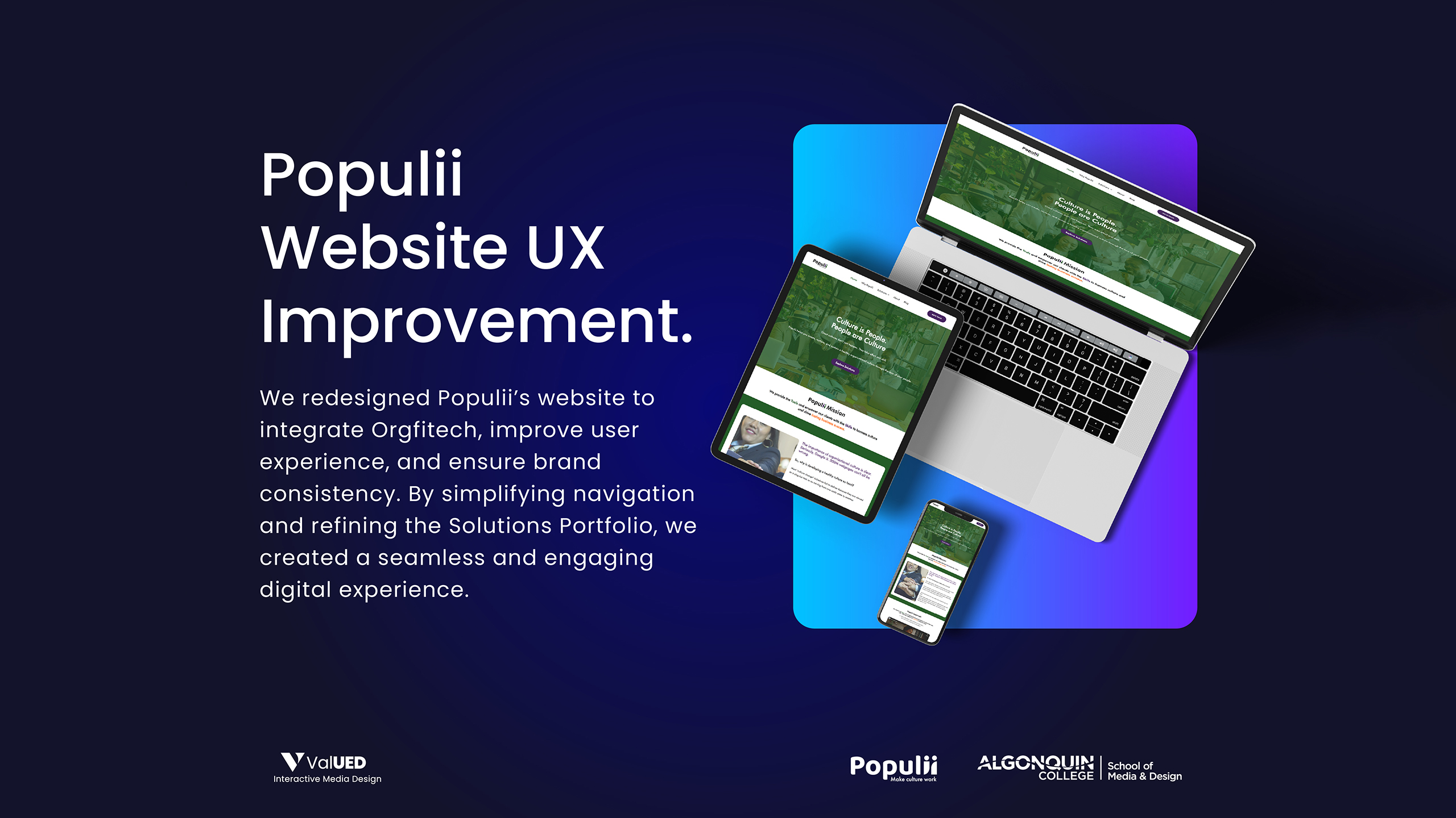
Populii’s UX Improvement
-
Category
UX Improvement
-
Role
Team Lead
-
Project Start Date
January 06, 2025
-
Tools
Figma , WordPress
-
Tag
Website
-
Project End Date
April 18, 2025
Overview
Populii approached our team at Algonquin College to revamp their outdated marketing website. The existing site lacked engagement, clarity, and alignment with their growing product suite. As the Team Lead, I oversaw the entire UX redesign process—from discovery to implementation.
Goal: Redesign the website to improve clarity, boost conversions, and reflect the evolving vision of Populii as a dynamic, feedback-driven platform.
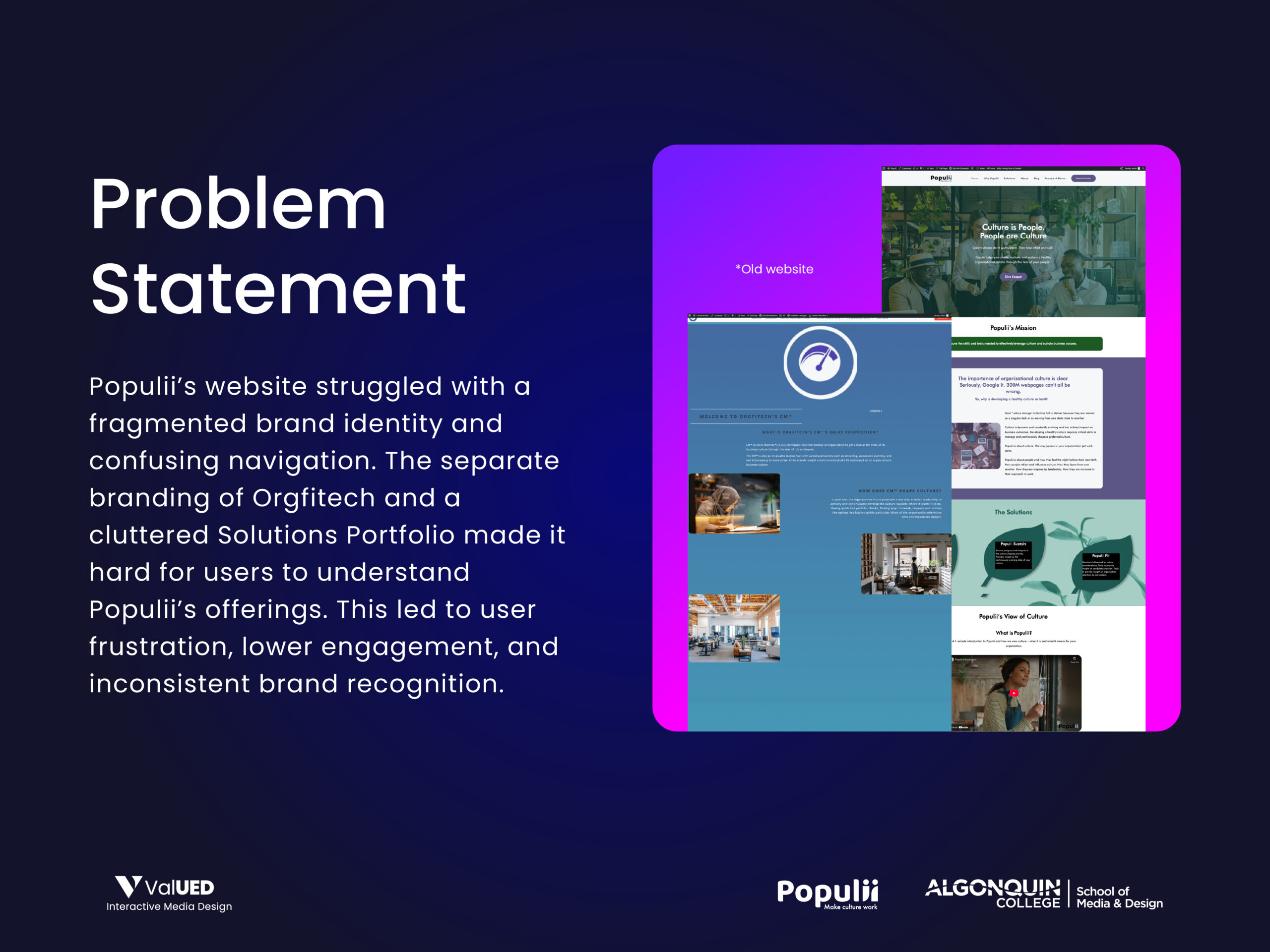
Understanding the Problem
Populii’s website felt outdated, cluttered, and misaligned with their value proposition. Mobile usability was inconsistent, CTAs were vague, and the site lacked a clear user flow to guide potential clients. Our first step was a comprehensive UX audit where we uncovered three key issues:
- Disjointed content structure
- Weak mobile responsiveness
- Low conversion engagement on call-to-action areas
These findings helped us define a focused direction for our redesign process.
My Role
As the Team Lead, I wore multiple hats: conducting stakeholder interviews, leading UX research sessions, facilitating design sprints, and ensuring consistent collaboration between designers and developers. I also managed client communications and led the final presentation.
Research & Discovery
We began by conducting stakeholder interviews to deeply understand Populii’s business goals, pain points, and target users. This was followed by a heuristic evaluation of their existing site and a competitive audit of similar platforms in the engagement and feedback space.
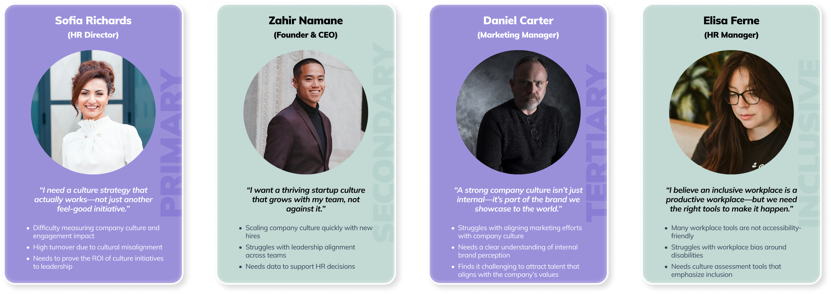
To translate our findings into actionable design insights, we created four personas that represented distinct user types and their unique challenges:
- Sofia Richards (HR Director) – Focused on proving the ROI of culture strategies and solving high turnover issues.
- Zahir Namane (Founder & CEO) – Needs scalable culture solutions and data to support leadership decisions.
- Daniel Carter (Marketing Manager) – Seeks alignment between brand and internal culture to attract the right talent.
- Elisa Ferne (HR Manager) – Advocates for inclusive, accessibility-friendly workplace tools.
These personas became a cornerstone for our design decisions and helped us prioritize features that supported each user’s needs and frustrations.
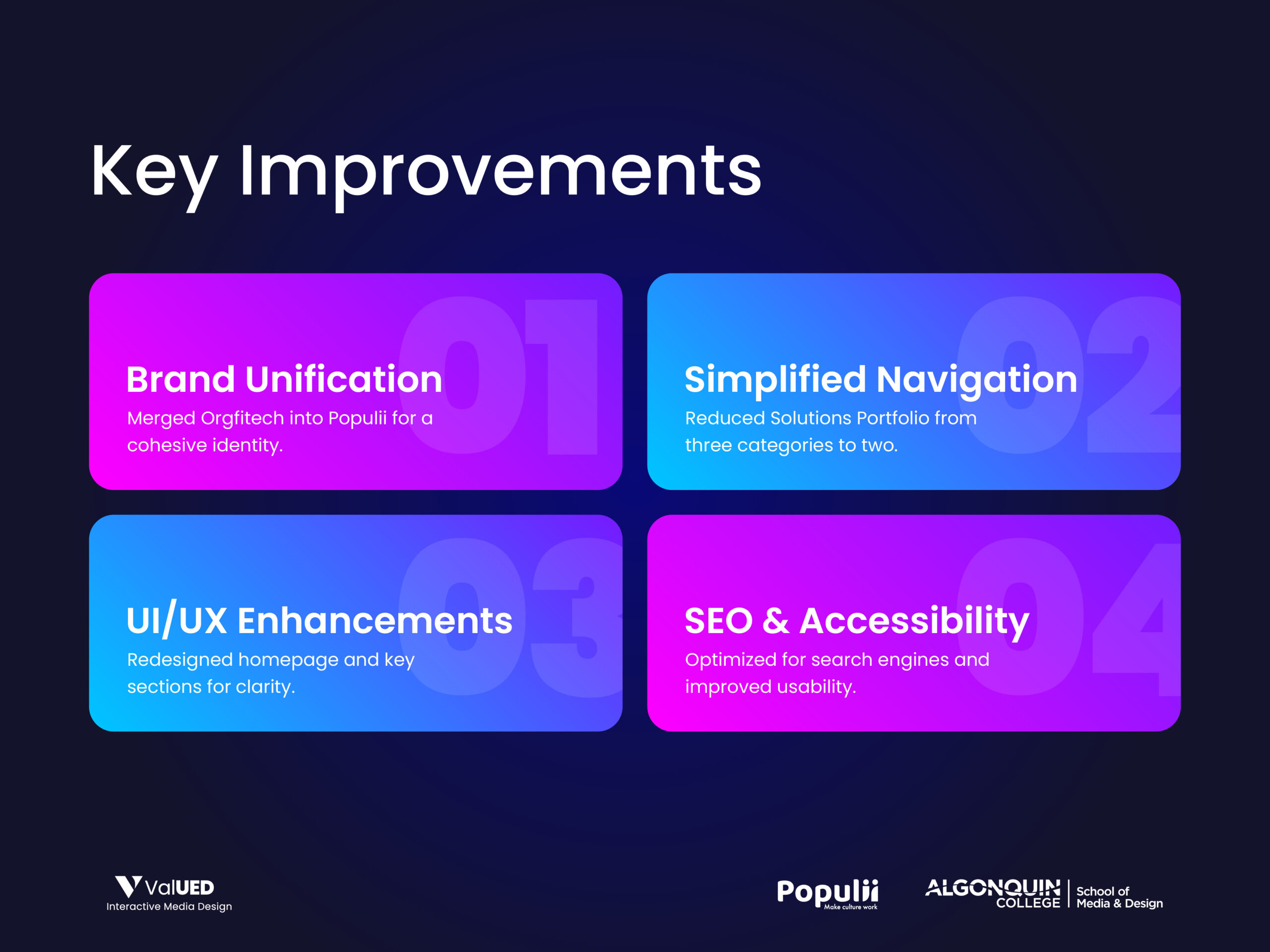
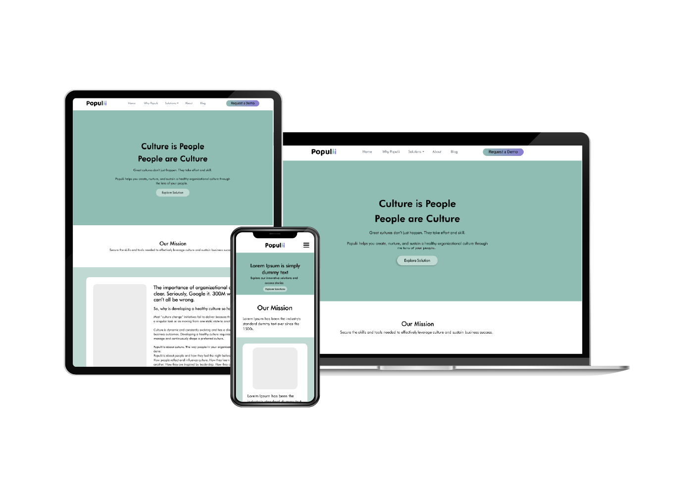
From Wireframes to Visual Systems
Once we had a clear direction, we moved into sketching mid-fidelity wireframes. The goal was to simplify the information architecture and improve scannability. We stripped away noise and focused on clear messaging, visual hierarchy, and consistent layout patterns.
As we transitioned to high-fidelity design, I created a UI system that mirrored Populii’s tone—professional, trustworthy, and modern. We chose a cool blue palette to establish trust, paired with clean sans-serif typography and subtle motion effects to guide the user journey.
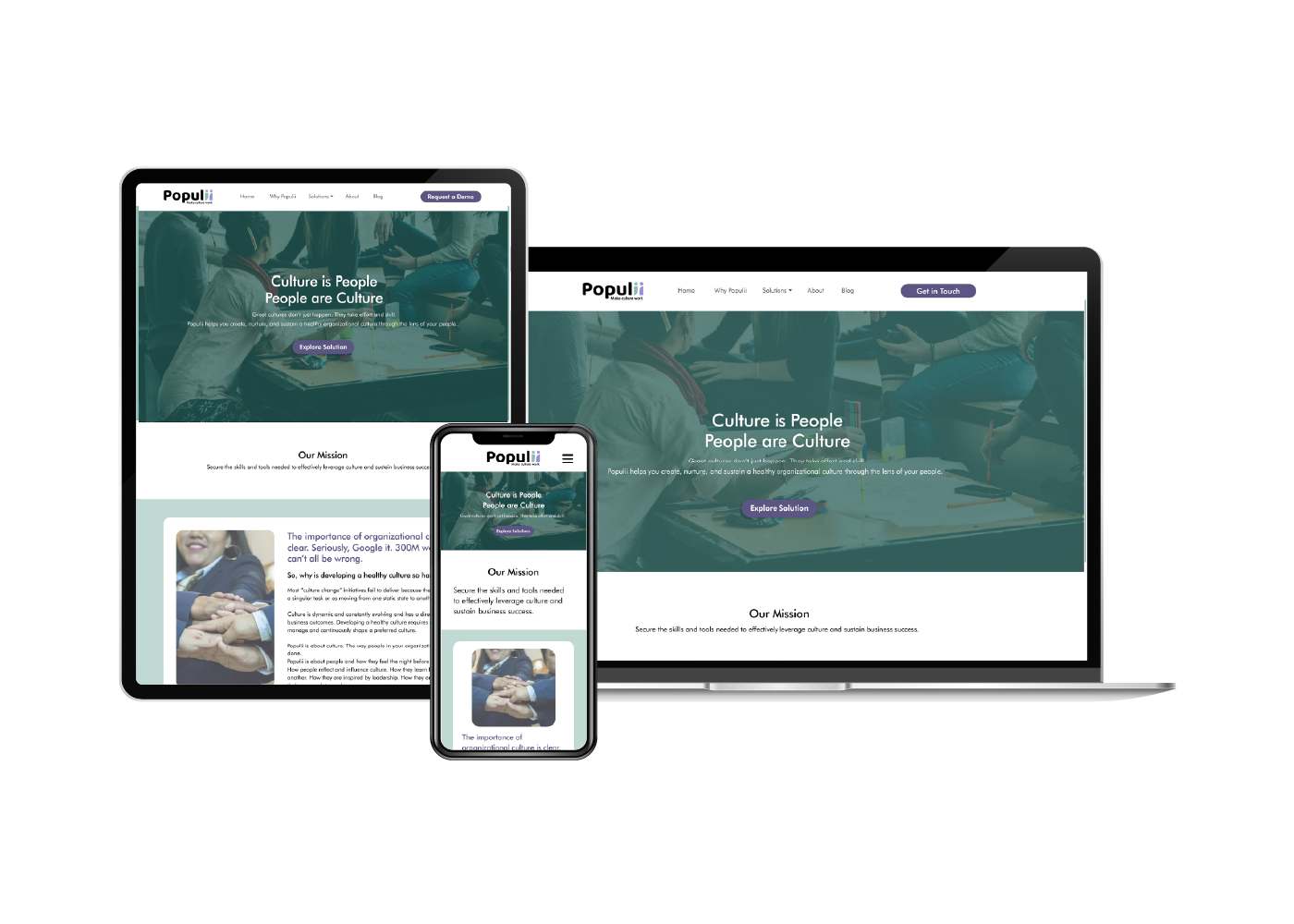
Development & Implementation
To ensure scalability and ease of content management for the client, we developed the site using WordPress, leveraging Elementor and OceanWP. I oversaw the design-to-development handoff and worked closely with our developer to ensure pixel-perfect execution.
We also implemented accessibility features to meet WCAG 2.1 standards—ensuring contrast ratios, keyboard navigation, and alt-text compliance were all in place.
Outcome & Impact
The redesigned Populii website offered a significantly improved user experience—both visually and functionally. The mobile experience was seamless, CTAs were strategically placed, and the visual hierarchy clearly communicated the platform’s value. The client was highly satisfied with the end result, and we received formal approval after our final walkthrough.
"This is exactly what we needed to scale. Thanks to your team for the amazing work."
What I Learned
This project taught me the importance of early collaboration and iterative feedback. Leading a multidisciplinary team helped me sharpen my communication and time management skills. Most importantly, it reinforced the value of user-centered design when paired with clear business goals.

