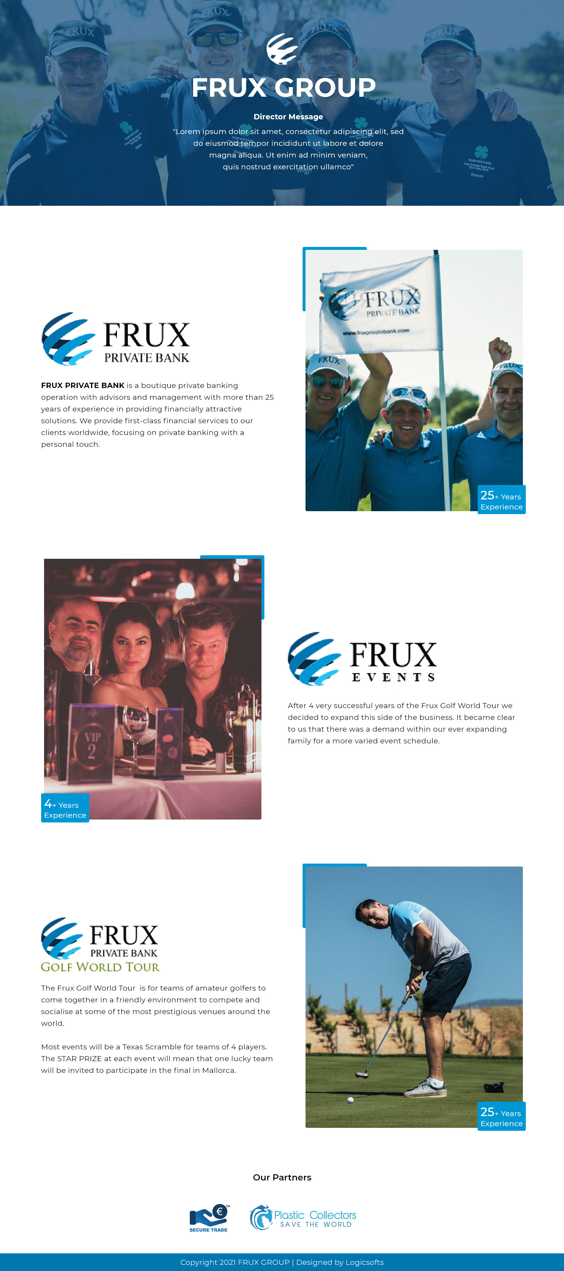
Background
Frux Group is a diversified corporate entity that operates across several industries including fruit and vegetable wholesale, prepared-food production, and group management. Their website required a design that could clearly communicate complex business lines, support multilingual content, and project a credible, structured corporate brand. I was engaged to completely redesign the site’s interface, focusing on clarity, brand cohesion, and ease of navigation for international stakeholders and partners.
My Role
In my role as UI Designer, I delivered polished high-fidelity mockups covering the homepage, "About Us", individual business verticals, and contact sections. While there was no formal UX research phase, I implemented user-centered visual strategies—such as clean information hierarchy, language toggles, and intuitive navigation—to ensure users could easily locate relevant corporate information. I also ensured responsive layouts that catered to both desktop and mobile users, and I coordinated with developers to ensure smooth handoff and implementation.
The Problem
The previous site was text-heavy, lacked visual structure, and did not effectively guide users through the company’s varied operations. Language switching and navigation between different divisions (e.g., FRUX Inc., AJINOYAMATOJI, FRUX Holdings) were unclear, and the overall design didn’t reflect the group’s organized, professional, and international character.
Reflection
This project reinforced how strong UI design alone—without in-depth UX research—can greatly improve clarity and brand perception for a complex corporate site. By focusing on clear segmentation of business lines, well-designed language selectors, and structured visual hierarchy, I was able to streamline the information architecture and elevate the group’s credibility.
Visit the live website: Frux Group