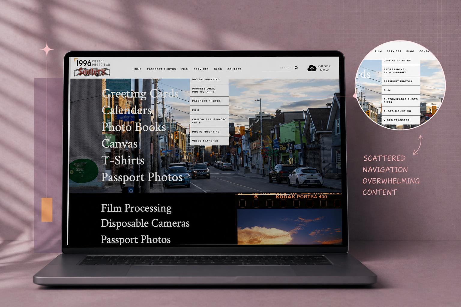
The Problem
Approach
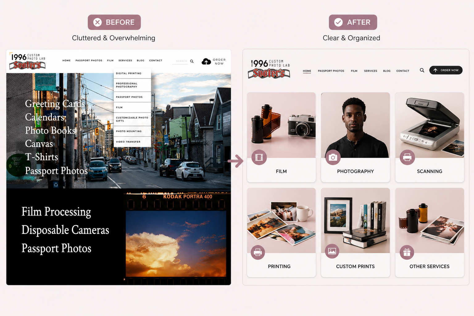
Restructuring the Experience
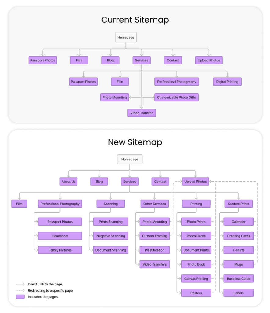
Information Architecture
Creative Direction
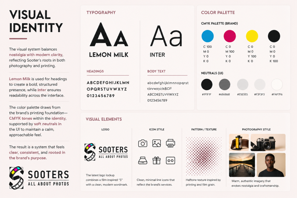
Visual Identity
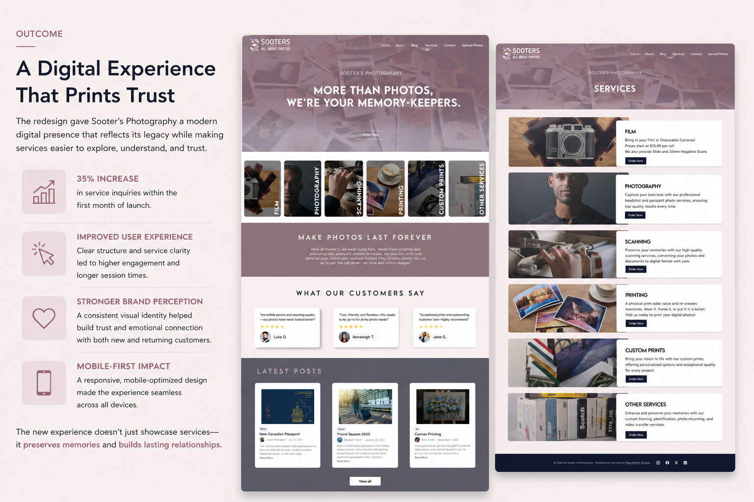
Outcome
Reflection
More Projects
The Problem
Approach
Restructuring the Experience
Information Architecture
Creative Direction
Visual Identity
Outcome
Reflection
More Projects